The Neutral Sanctuary of Designer Katie Frazier
March 26, 2020
Text by Marni Elyse Katz Photography by Sarah Winchester
As a designer, color and pattern are a big part of Katie Frazier’s everyday life. To counteract the visual chaos of the swatches and samples that surround her in the studio, never mind the whirlwind of activity and accoutrements that accompany life with two small children, Frazier favors a home that is calm, composed, and consistent. “I want to live in a serene space where I can escape from the constant stimulation,” she says.
Her prescription for establishing a peaceful urban habitat in her airy 3,800-square-foot sublet starts with a neutral color palette. It’s a choice, she says, that surprises friends and clients, but has always been her personal preference. Don’t expect a monochromatic scheme in non-child-friendly beige. Frazier’s design is more bold than bland, with grounding black elements that run through the light-filled, single-level penthouse of this converted South End church.
The choice of black was driven by the black sofa that the couple brought from their former loft. Since its scale was too small for the living room, it’s ensconced in the den, smack in front of a tall, pointy church window. That, in turn, spawned the black leather sling chairs, which Frazier had her eye on for years, as well as the textural black wool rug in the living room. “I always wanted to do a dramatic black sisal rug,” Frazier says. “This one feels like sisal, but isn’t, so the kids can spill on it.”
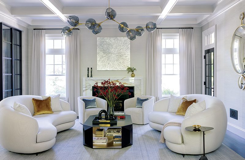
As a foil to the black, Frazier took cues from the gray, taupe, and cream veining of the living room’s Bardiglio marble fireplace surround. While the den is a grownups-only getaway, the living room is family central. As such, it’s more relaxed, with softer silhouettes and a paler palette. Sofas are upholstered in cool gray performance linen, and off-white pillow-y chairs resemble clouds. Frazier pulls these shades into the master bedroom, where the overall scheme is lighter still. Except for those skinny slashes of black. “I don’t want every room to feel the same, but I love consistency,” Frazier says. “All the spaces are tied together.”
Frazier also loves symmetry, which in her home reads as modern and relaxed rather than rigid. Chairs, lamps, pillows, and pictures come in pairs, though not everywhere. Sometimes it’s sets of three. The arrangements create a reassuring rhythm. “I find symmetry very calming,” she says. “A balanced environment helps you feel balanced inside.”
When Frazier uses color, she does so with purpose. She explains that using a colorful piece—or a trio of pieces as she did in the playroom—is more impactful against a neutral backdrop. “It jumps out and allows you to focus on it without distraction,” she says. Despite the literal bursts of color in the playroom, the space is also quite orderly. “Even when there is a toy explosion, it feels grounded,” she says. “That feeling of overstimulation is so true for our kids, too. This is their own little oasis.”
Project team
Interior design: Katie Frazier, Katie Frazier Interiors
[WPSM_COLORBOX id=73546]
Share
![NEH-Logo_Black[1] NEH-Logo_Black[1]](https://www.nehomemag.com/wp-content/uploads/2022/08/NEH-Logo_Black1-300x162.jpg)


You must be logged in to post a comment.