Rachel Hazelton: Shades of Gray
June 25, 2013
Gray is a classic and still very on trend. Capturing the perfect shade of gray paint for your interior can be challenging. As a designer known for favoring a neutral palette, I love using gray in my interiors. Through the years, I have created a collection of my favorite paint colors and wallpapers to capture the perfect shade of gray.
Stonington Gray HC-170 by Benjamin Moore; Photo courtesy of Benjamin Moore
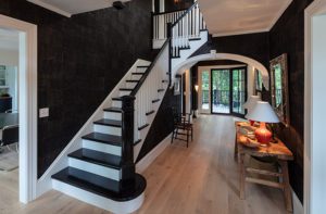
I recently chose Stonington Gray for the interior walls of a client’s summer home. Paired with Super White trim paint, Stonington Gray’s pale tone is peaceful and relaxing. It’s perfect for the beach since it reminds me of the gray feathers of a gull, smooth gray beach pebbles and the ocean on a cloudy day.

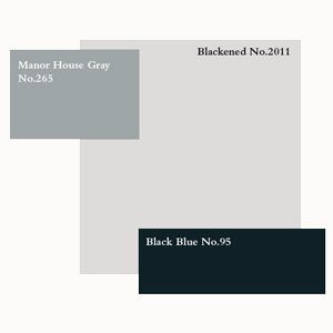
Manor House Gray by Farrow & Ball; Photo courtesy of Farrow & Ball
Farrow & Ball’s Gatsby palette. Photo courtesy of Farrow & Ball
Farrow & Ball, known for their small collection of classic and historic paint colors, has created a palette inspired by the F. Scott Fitzgerald’s 1925 novel, The Great Gatsby. In the Roaring Twenties, ceilings were often painted in high gloss. Farrow and Ball recommends painting a ceiling in Manor House Gray in full gloss. A gray glossy painted ceiling is so glamorous and makes a design statement of drama and luxury.

Down Pipe No. 26 Farrow & Ball; Photos courtesy of Farrow & Ball
Down Pipe is a deep rich charcoal gray. I cannot wait to use this as an interior trim paint to emphasize interior architecture.
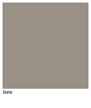
Slate by Restoration Hardware Paint; Photo courtesy of Restoration Hardware
Slate is the perfect deep and neutral warm gray. I recently painted the entire first floor of a client’s home in Restoration Hardware Slate. The effect is cozy and warm. Slate is beautiful as a backdrop for shades of linen, white and touches of black. Slate is a fabulous compliment for bold rich color such as emerald green. Well-known designer Kelly Wearstler used a palette of warm gray and emerald green in her super chic design of the Viceroy Hotel in Santa Monica.
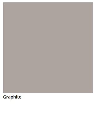
Graphite Restoration Hardware Paint; Photo by Restoration Hardware
Graphite is also a warm mid-tone gray that is slightly lighter than Slate. I’ve used Graphite in a master bedroom and bath paired with amethyst. Graphite reminds me of the gray veins in classic white marble. So Graphite is beautiful in a bath or kitchen with carrera or calcutta marble.
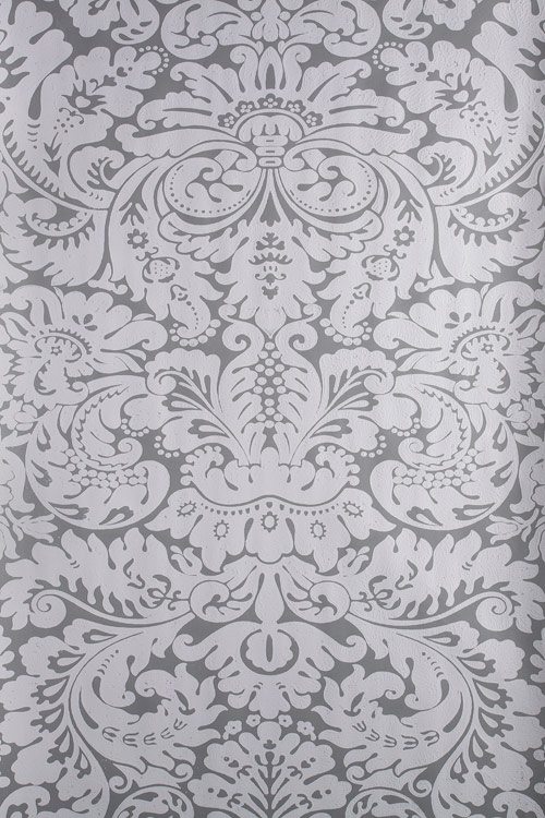
Silvergate Wallpaper No. 879 Farrow & Ball; Photo courtesy of Farrow & Ball
Silvergate wallpaper in Farrow & Ball’s gray paints is a true classic. I love the contrast of the masculine quality of gray paired with the feminine elegance of the damask pattern.
-Rachel Hazelton
Rachel Hazelton is a Boston-based full-service interior designer specializing in high-end residential design projects. A featured designer in New England Home‘s Designer Snapshot, Rachel also teaches and guest lectures on interior design and has been a panel speaker at Design Boston at the Boston Design Center.
Share


