A Bright, Light and Contemporary Home in Weston, Massachusetts
March 1, 2018
The trick for this contemporary suburban Boston house—one that the design team clearly mastered—was making the complex design look beautifully uncomplicated.
Text by Debra Judge Silber Photography by Tria Giovan Produced by Kyle Hoepner

What does simplicity look like? It may be an odd question, but when you’re designing a new home, it’s one that requires an answer. Because what is a home, really, if not the physical expression of qualities like simplicity, or tranquility, or elegance? Arriving at the answer, though, is often less about aiming for a preconceived notion than making a series of small decisions that lead you, as if by happenstance, to the place you want to be.
Designer Beth Martell calls it “the serendipity of design,” and after thirty-five years in the business, it still amazes her. So when asked to design the interior of a new home for clients in Weston, Massachusetts, she understood the decisions they made together at the start would lead them where they wanted to go.
Martell knew her clients—a husband and wife with four teenagers—well. She had aided in a renovation of their previous home, and worked with other members of their family. By contrast, the couple engaged architect David Stern through a formal process, soliciting proposals and interviewing several architects before making their choice. Working in New England, Stern had designed his share of traditional homes. But his real passion is for contemporary design, which is exactly what these clients desired. “They definitely wanted a modern house,” Stern says, “and they had a pretty good vision of the types of spaces they wanted.”
Those spaces included formal living and dining rooms, a large kitchen, a family room, office, bedroom suites for the children, and a large master with his-and-her bathrooms. The list also included a kids’ hangout, an exercise room, and enough storage to keep the house from feeling cluttered.
Stern’s process, like Martell’s, opens the project to the inevitability of becoming whatever it wants to be. “I rarely start a project where we know what it’s going to look like when we begin,” he says. “We start with the spaces, the circulation, the pathways through the building. Then we look hard at what we can learn from the site and how the building relates to it.”
He describes the finished home as classically modern, evoking a sense of the early twentieth century rather than the high-tech trendiness often associated with contemporary styles. The exterior hints at the Secessionist style of 1920s Vienna, with a smooth stucco exterior, flat rooflines, and zinc-coated copper details. Beyond the formal facade, floor-to-ceiling windows multiply, opening the family spaces to the outdoors. “The house fractures as it moves to the back, and the forms become less pure and more sculptural,” Stern explains.
Inside, untrimmed plaster walls and rift-sawn oak flooring throughout keep the materials palette minimalist as well. “It’s all about simple shapes, honest material expression, a simple approach,” Stern explains.
With these spaces in mind, Martell guided her client in choosing the colors and fabrics she envisioned there. Immediately, the two agreed on a backdrop of Benjamin Moore Super White throughout the house. “She wanted a very edited look, very fresh, very white, very contemporary,” Martell explains.
“I love what you can do around white,” says the homeowner. “Having a very neutral color palette allows you to be creative in so many other ways.”
For builder Kevin Lagassé, Stern’s design translated to one word: precision. “From a builder’s perspective, the trick in contemporary construction is to take something that is very complicated, and in the end, make it look very simple,” he says. “It requires a lot more precision in your pre-planning, from light-fixture alignment to the intersection of walls and ceilings. Everything is crisp and clean, and there’s no molding to hide anything.”
This attention to detail paid off. Installation of the home’s open stairway, for example, might have been a nail-biter. Instead, says Lagassé, “It was so well planned, the actual install went in just as designed.”
The open-riser stair with its glass guardrail reflects the sense of transparency that evolves in the house as one moves from the formal, almost traditional symmetry of the living and dining rooms to the more relaxed spaces beyond. The homeowners’ art collection, which includes old favorites as well as pieces purchased specifically for this home, helps draw visitors through the house.
Over the living room fireplace, a swirling relief in white lacquer by Osmundo Echevarria embeds art in the house itself. The furniture here, as throughout the house, is predominantly white, offset by the subtle pink and mother-of-pearl resin squares of the Nada Debs coffee table. Silver surfaces quietly in the occasional tables and in metallic threads woven into the white carpet.
For the fireplace in the family room, Martell worked with her partner, architect Enda Donagher, to design a Mondrian-style grid of polished nickel that frames rectangles of rigid parchment.
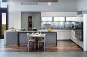
Rectangles reappear in the kitchen, where the cabinets—some lacquered, others glass—read as neatly stacked white boxes. Every surface is smooth, from the stainless steel on the walls to the back-painted glass of the countertops to the quartzite breakfast bar. Stern designed the kitchen as well. “It is architecture,” he says. “We’re very focused on the function, the detail, the aesthetic, and how it ties in with the design of the house.”
A cabinet wall with a large opening in the center separates the kitchen from a wall of glass and a door that opens to garden beds planted with peonies and irises and a large patio that also connects to the living room. In designing the landscape, the team from Stephen Stimson Associates mirrored the home’s geometry by projecting its elevations like a shadow on the ground. “It’s as if you were taking the facade and laying it down flat on the site to get the shape and scale of the outdoor rooms,” explains Glen Valentine, a principal with the landscaping firm.
The effect is contemporary, but Valentine notes that the landscape plan reflects a classical nine-square grid. This is best seen in the front of the house, where a parking court flanked by groups of flowering hawthorns comprises the first row of squares. It echoes, he says, the striking simplicity of the plan. In spring, white blossoms appear on the trees, the vinca, and hydrangeas, marrying up through the windows with tones and textures Martell and her client pored over in the beginning. “We made a decision, and it took on a life of its own,” Martell says. “The more it evolves, it just gets better and better and better.”
Architecture: David Stern, Stern McCafferty Architecture + Interiors
Interior design: Beth Martell, Martell-Donagher
Builder: Kevin Lagassé, The Lagassé Group Custom Builders
Landscape design: Glen Valentine, Stephen Stimson Associates Landscape Architects
Share
![NEH-Logo_Black[1] NEH-Logo_Black[1]](https://www.nehomemag.com/wp-content/uploads/2022/08/NEH-Logo_Black1-300x162.jpg)




You must be logged in to post a comment.