Simply Sophisticated
March 6, 2013
Text by Paula M. Bodah Photography by Karin Lidbeck Brent Produced by Karin Lidbeck Brent


Some people like to hold on fast to the past once the nest is empty. They love welcoming grown children, and eventually grandchildren, back to the family home, reliving and passing on cherished traditions.
Not the couple who live in this Cambridge, Massachusetts, condominium. After thirty-two years in a traditional colonial house in the Boston suburbs, they were ready for a big change. They imagined themselves in a smaller space, closer to the urban action. They also dreamed of clearing out the years of accumulated stuff—beautiful stuff, to be sure, the wife notes—but unnecessary for this stage of their lives.
The two-story unit occupying about 2,100 square feet on the sixth and seventh floors of a building in Harvard Square promised the less-encumbered life they envisioned. “The condo was very simple, like a tube, really,” the homeowner says. “I saw it as an opportunity to go with something very contemporary. But I wanted luxury.”
All they needed was an architect who, like them, saw the potential in the rather cramped, dark space. Word of mouth led them to Stephen Hart, of Hart Associates Architects, who had worked with several other homeowners in the same building. “We just hit it off,” Hart says about his clients. “We don’t have a deep portfolio of modern work, so we were delighted to get this opportunity to show our facility for it.”
As is so often the case in urban buildings converted to condominiums, challenges and constraints abounded. The low ceilings—well under eight feet—posed a particular challenge. Adding lighting and disguising ductwork is difficult when you’ve lost the option of deep soffits or dropping ceilings, Hart explains. Furthermore, plumbing and utility pipes that run to units above and below don’t always show up in the most opportune places.
Small matters, it turns out, for Hart and project manager Jennifer Lyford. Evidence of their ingenuity makes its first appearance just inside the front entrance, where the door opens roughly at the unit’s midpoint. A left turn leads to the dining and living areas; a right turn to the kitchen and, beyond, the spacious master suite. Straight ahead, where one would hope for a welcoming entry foyer, the new homeowners were confronted with little more than a square hole in the floor where the stairs leading to the lower level were surrounded by a wall on one side and by the plainest of wooden railings on the other three sides. “Job one was to make the stairway safe and bright,” Hart says.
Hart and Lyford went far beyond that, turning the space into a gracious foyer. They took the wall down, bringing an instant sense of light and openness to the area, and covered the floor around the staircase in black granite. To hold the pipes and wires the wall had housed, they cleverly contrived a round column. Clad in gray glass tile, the column is beautiful as well as utilitarian. The wooden railing gave way to a glass railing trimmed with stainless steel. Overhead, Hart raised the ceiling as much as he could, finished it with Venetian plaster to give the illusion of more depth and created a round, shallow soffit around the raised area to hold utility wires. “We lit the stairs every which way,” the architect says. Round pendants glow from above, and each riser of the walnut steps holds LEDs. “The whole notion was to make it a sculptural element as well as making it brighter and safer.”
As the builders on the project, Stephen Payne and Steve Clarke of Payne/Bouchier are used to working in spaces that present structural difficulties. “The challenge was more for the architects than for us,” Payne says modestly. “Steve [Hart] and Jennifer designed solutions that made it all work so well.” He cites the column that holds the mechanicals as an example. “With the glass tile, it’s a delightful object in the room instead of an eyesore.”
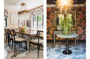
The owners and their design team settled on a color scheme based on natural wood tones and gray. Don’t think that means the contemporary space is severe or lacking in personality, though. Above the floors of dark walnut that run from the foyer to either end of the unit, the walls form a series of raised panels, niches and doors clad in several different materials—from wood to marble to pearl-colored paint—that add visual excitement. A panel in the foyer, for instance, is covered in Carrara marble that wraps around a corner and into the kitchen, where it becomes a backsplash above marble counters and blue-gray painted cabinetry. On the foyer’s opposite side, a closet, powder room and the unit’s electrical panel hide behind honey-hued oak paneling. The oak reappears in the living room, this time in a basket-weave pattern, where it covers a recessed wall that holds the TV.
Walls and moldings form what Hart calls “a very rectilinear, crisp vocabulary.” Look up, though, and ceilings and light fixtures tell a different story. In an echo of the foyer’s round raised ceiling, a shallow recess forms a graceful curve along the ceiling across the open living and dining areas. Amoeba-shaped ceiling light fixtures, sconces and the dining chandelier all come from the same Estiluz Lighting line. “They give the place visual vitality and are a nice counterpoint to the crisp lines,” Hart says.
A further counterpoint—and more evidence of the design team’s ingenuity—is found in the stunning pale-gray leather sofa in the living room. “It was a tricky space to furnish,” Hart says. “It’s relatively small so there’s not really enough room for two seating areas. And it has beautiful views, but you don’t want to be looking outside all the time.” The solution is an L-shaped piece with a rounded corner and two back sections set on a track. The back pieces move to orient seating toward the view, toward the TV or so that people can face each other for conversation. Round-backed swivel chairs and round ottomans in charcoal gray make the perfect companion pieces.
The same simple palette dresses the master bedroom. Here, a recessed wall between built-in shelves and nightstands acts as a headboard. In a nod to the homeowners’ background (the couple moved to the Boston area from Greece many years ago), the wall is covered in Greek Key–patterned paper.
The unit’s lower level holds the laundry room, a guest bedroom and the husband’s study, which shows the one exception to the neutral palette. Floor-to-ceiling shelves and cabinets line three walls, while the fourth wears a luscious shade of sky blue. “We were looking for the perfect Greek cerulean blue,” Hart recalls. “We used blue painter’s tape to hang a bunch of swatches of paper painted various blues. In the end, we decided the color of the tape was the winner.”
The perfect color may have come about by happy chance, but it’s the only accidental thing about this well-conceived and beautifully executed design. •
Architecture and Interior Design: Hart Associates Architects
Builder: Payne/Bouchier
Share


You must be logged in to post a comment.