Lakeside Lovely
July 1, 2013
Though the homeowners love the clean lines and openness of contemporary architecture, they wanted something that fit the rural landscape. Something like a camp.
Text by Erin Marvin Photography by James R. Salomon Produced by Kyle Hoepner


Summer in Maine is a special time of year: crisp bright sunlight reflects off sparkling, cerulean-blue waters; bursts of color from barnyard lilies, milkweed, goldenrod and black-eyed Susans dot the lush green landscape; calls of chickadees intermix with the laughter of children; and the scent of freshly baked wild-blueberry pie fills the air.
Its charms are hard to resist—just ask this Boston couple who drove up and down the coast of Maine, from the New Hampshire border to Bar Harbor (and everywhere in between), in search of the perfect summer getaway. They had started to lose hope when they happened upon this particular spot. “We had looked at a lot of properties, and seen a lot of lakes, but we knew before we got out of the car that this was a special piece of land,” says the wife.
The peninsula-shaped terrain commanded stunning views and easy access to a large lake that beckoned to their watersports-loving young family. The existing cottage was charming, but very rustic—and though the couple’s original intent had been to buy a summer house, not to build one, the site already felt too much like home to let it go.
The couple had kept interior designer Kristina Crestin in the loop as they’d looked at houses. Once they decided to rebuild, they contacted architect Art Dioli, who happened to have his own vacation house nearby. Dioli brought in local builder Ron Dunn and a summer dream team was born.
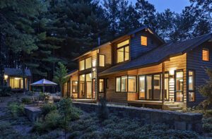
Though the homeowners love the clean lines and openness of contemporary architecture, they wanted something that fit the rural landscape. Something like a camp. “I like contemporary buildings, but I also knew that we loved this place for the natural environment,” says the wife. “So with Kristina’s help, the architect and the builder were able to marry something that was fairly clean lined yet traditional looking on the outside. It has a very modern functionality even though we used very natural ingredients.”
At 2,200 square feet, the new structure has the same footprint as the original camp, but sits about ten feet farther back from the water (“still within spitting distance,” quips Dioli). Material choices were just as important: “I like to have the structure feel like it’s growing out of the ground,” says Dioli, who used stone around the perimeter topped with red cedar shingles and a traditional metal roof. “Because of its location—it’s on a peninsula, twenty-five feet from the water on both sides—we really wanted to give it a flavor of blending into the landscape instead of being a wart on the landscape. Our goal was to make it seem as if it has always been there.”
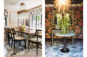
The interior layout was designed around the homeowners’ desire for a large living space that was open and connected to the outdoors. One west-facing wall is actually a paneled door system that folds away completely, imbuing the space with a porch-like feel. A large stone fireplace and chimney forms the focal point of the great room, and timber-frame beams reach up from v-groove walls to a ceiling clad in barn board. Finding enough barn board for the ceiling and trim throughout the house presented quite a challenge, until builder Ron Dunn discovered a seller who’d been taking down old barns since the 1950s. It took Dunn multiple visits to sort through numerous large piles of wood—which happened to be covered in snow at the time—carefully choosing and sweeping clean each piece until he had 10,000 board feet of wood.
Interior color palette discussions also started early on, and designer Kristina Crestin and the homeowners came to the consensus they wanted to keep things clean, simple and organic with a heavy emphasis on texture. The mint julep–hued Viking stove was the jumping off point for the great room’s green accents, tied together by kitchen cabinetry, twin swivel armchairs and an ombré striped rug. Complementary shades of orange and blue add additional color.
The point of a camp is to hang out and relax, so although the majority of the furnishings are new, nothing is too precious or irreplaceable. “We wanted bulletproof,” says the wife and mother of three, pointing out the frequency of dirty feet and wet bathing suits the camp would see over the course of the summer. “I didn’t want to spend my time worrying about keeping everything looking pristine.”
Functionality played a major role in spaces as well. “Interior design is not just making things pretty, it’s worrying about the ergonomics,” says Crestin. “I can make it look beautiful, but I also make it work for the humans using the space.”
Take the kitchen area for example: the polished concrete counters are at the right height to comfortably wash, chop and cook. Barn board slabs on the kitchen island are run vertically to avoid seams, and stop short of the floor for easy mopping and vacuuming. Bar stools were kept small to not intrude on the corridor between the island and the upholstered armchairs, which swivel around completely for easy conversation with whoever is in the kitchen.
There’s plenty of seating for a crowd—the camp hosts frequent overnight guests—and a large reclaimed wood dining table flanked by Shaker chairs is perfect for family-style meals. When the wall folds back, a twelve-foot screen affords unobstructed views of the water, letting in the evening breeze but not the bugs.
The kids’ bedrooms pull double-duty as guest rooms when company comes. The daughter’s space is modern and fun with a color palette of green, rusty orange and mustard—what Crestin calls “earthy but updated.” The papier-mâché animal heads and funky artwork are a tongue-in-cheek nod to the camp’s fun vibe. When it’s time to share, the bottom bunk sleeps two while another body can snuggle in above.
The boys’ room is a study in space planning with a mix of double and twin bunk beds that sleep eight, steps that double as storage drawers and custom wall niches that have their own reading lights and outlets. A John Robshaw throw pillow, a vintage first aid poster and a small child-size chair from Casa Design are amusing accents to the smart red, white and blue color scheme.
The master bedroom, bright in cooler hues of aqua blue and creamy pale gray, remains a private retreat for Mom and Dad, tucked away behind an orangey-red, salvaged sliding barn door. More built-ins and floating shelves serve as extra storage space and a vintage glass bottle collection adds additional character.
Like any good camp, the home can comfortably fit a crowd: so far the record number of overnight guests is twenty-eight—and no complaints. •
Architect: Art Dioli, Olson Lewis + Architects
Interior designer: Kristina Crestin, Kristina Crestin Design
Builder: Ron Dunn, Dunn Builders
Share


You must be logged in to post a comment.